
Conversational Healthcare AI
I replaced GoodRx's confusing, coupon-first product with an AI-guided, member-first experience, mapped end to end and shipped into a live A/B test.
01 PROBLEM
When I dug into the product, I found an experience organized around GoodRx's internal feature silos rather than the person trying to fill a prescription. Search only handled prescription drugs, and it broke on the two things customers get wrong most: spelling a drug name and knowing their exact configuration of dosage and form. People would walk to the pharmacy counter holding the wrong coupon, get surprised by a higher price, and quietly stop trusting the product. Pharmacists absorbed the fallout, troubleshooting GoodRx's failures at the counter and growing more resentful of discount coupons with every bad handoff.
CONSTRAINTS
Focus on mobile web (most popular entry point)
Use the existing design system where possible
Small team
02 APPROACH
Product Evaluation
Executive leadership had never seen the whole journey in one place, so I mapped it myself: the company's first end-to-end service blueprint, covering every person, location, and system a customer touches between searching for a drug and walking out of the pharmacy. Laid out in one view, the problem was undeniable. Every actor, customer, pharmacist, and support hit friction at multiple steps. I named this the coupon-first model:
SERVICE BLUEPRINT
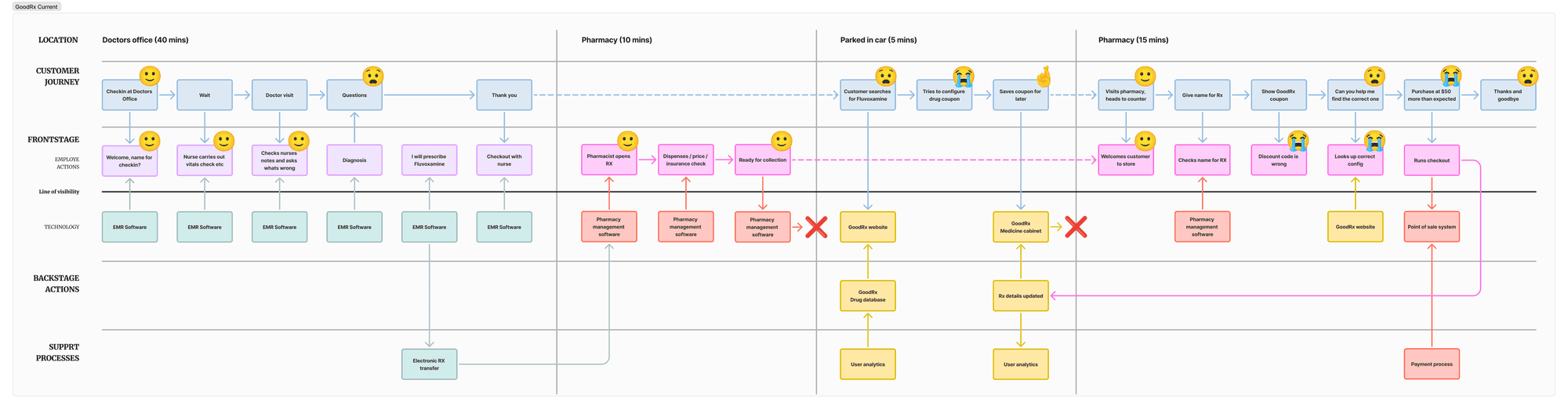
The blueprint made the product's structural problems easy to point at. The compartmentalized, feature-by-feature layout buried everything GoodRx could do beyond drug discounts (below left), and search was limited to prescription drugs only (below middle).
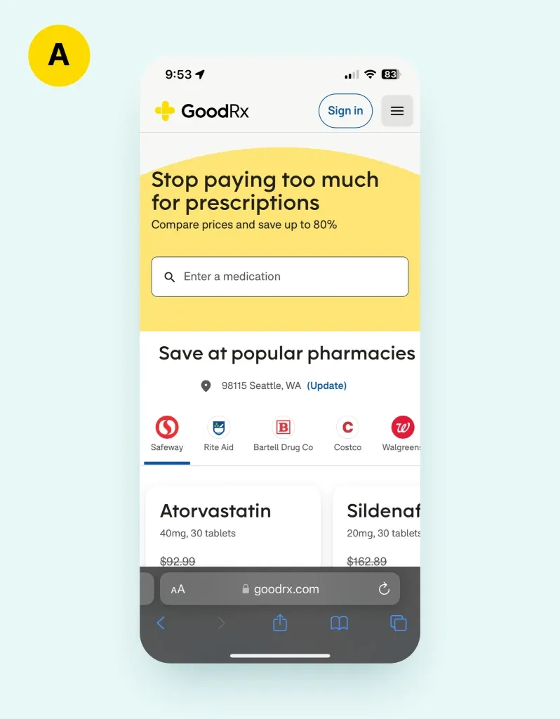
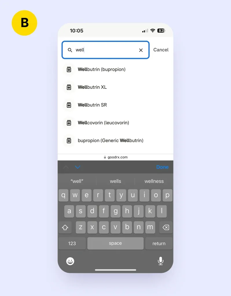
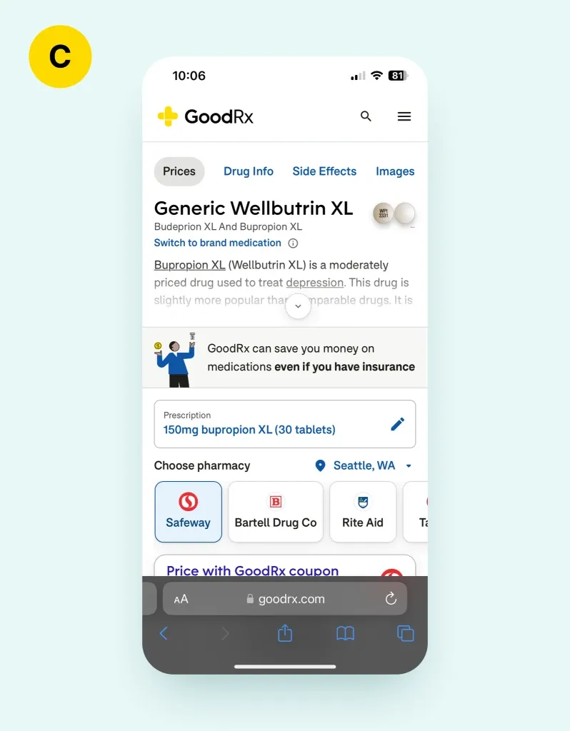
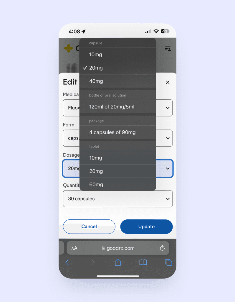
In testing, I watched search fail on ordinary spelling mistakes and on configuration details like dosage and form that most patients simply don't know (below left). That mismatch left customers holding the wrong coupon (below right), and the trust broke at the worst possible moment: standing at the pharmacy counter, being asked to pay more than the app promised.
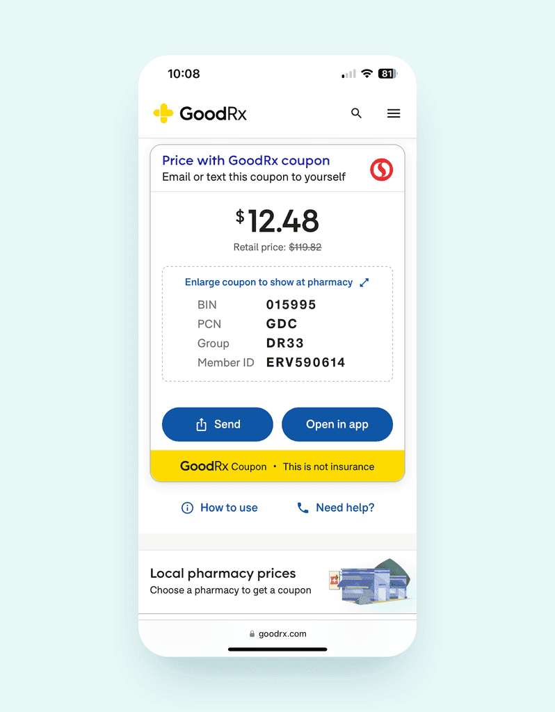
The blueprint also exposed the cost on the other side of the counter. Pharmacists were spending time untangling coupon mismatches they didn't create, and that friction was quietly souring them on GoodRx coupons altogether.
03 OUTCOME
Setting a Vision
Rather than patching the coupon flow, I designed a replacement for it: an automated system I called the member-first model. In it, the customer never configures a coupon at all. That one move eliminates the three biggest failure points I had mapped: customer-configured coupons, checkout failures at the counter, and pharmacists troubleshooting GoodRx's product on GoodRx's behalf. I built the case as a second service blueprint so leadership could compare the two models side by side.
SERVICE BLUEPRINT
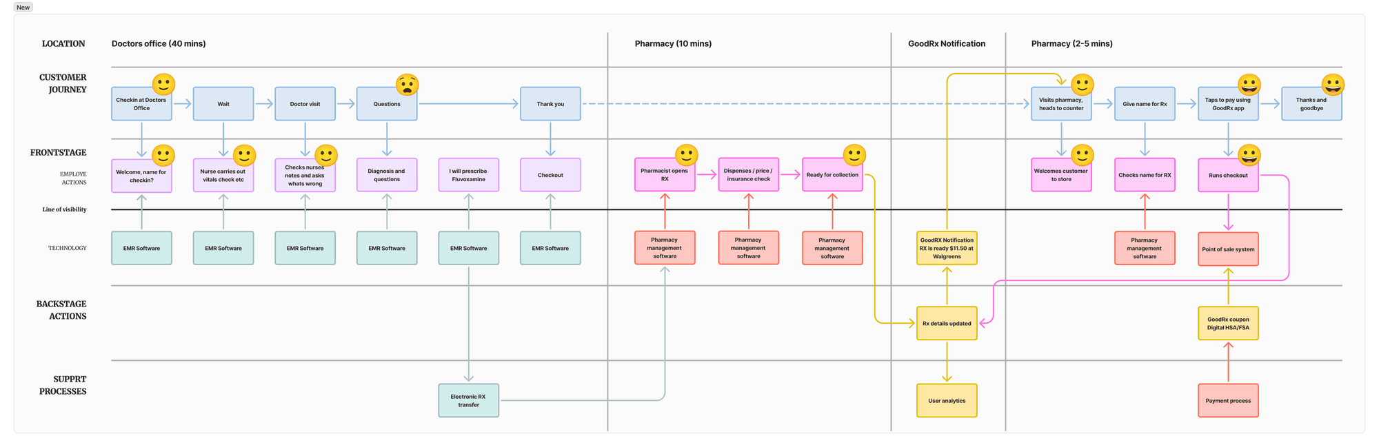
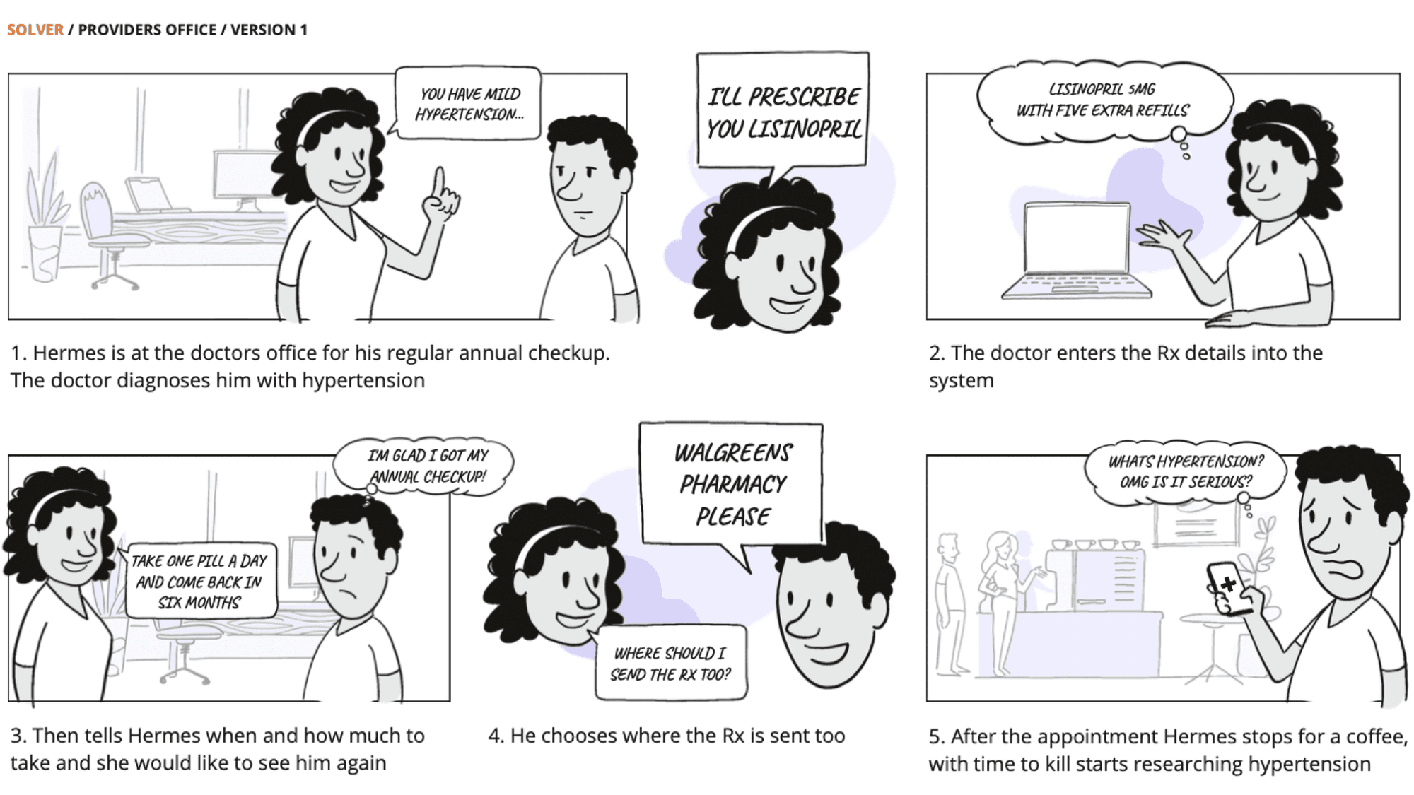
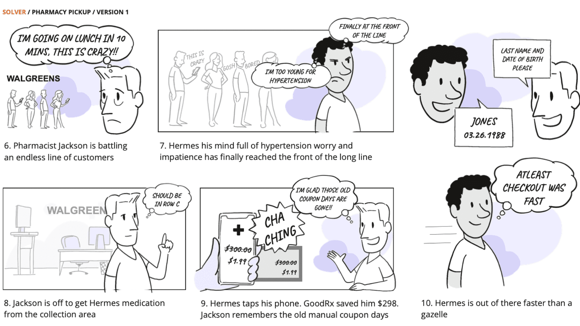
Blueprints convince analytically, but they don't make anyone feel the product. So alongside it I drew storyboards that walked leadership through the experience moment by moment: the idea, the emotional arc, and how simple the interaction becomes when the system does the configuration work.
WORKING BACKWARDS
Working backward from that vision, I broke the product silos apart and rebuilt the experience around conversational AI. Instead of making customers hunt through feature sections, I surfaced GoodRx's capabilities in context, at the moment in the journey where each one actually helps. My rule for the team: ship a cohesive product, not the company org chart.
The key mechanic I designed: anonymized customer data and AI identify the most common configuration of each drug in the customer's area, and the product sets that configuration on the customer's behalf instead of asking them to guess dosage and form. Claims succeed at the pharmacy counter far more often, and the pharmacist stops being GoodRx's unpaid support desk.
WIREFRAMES
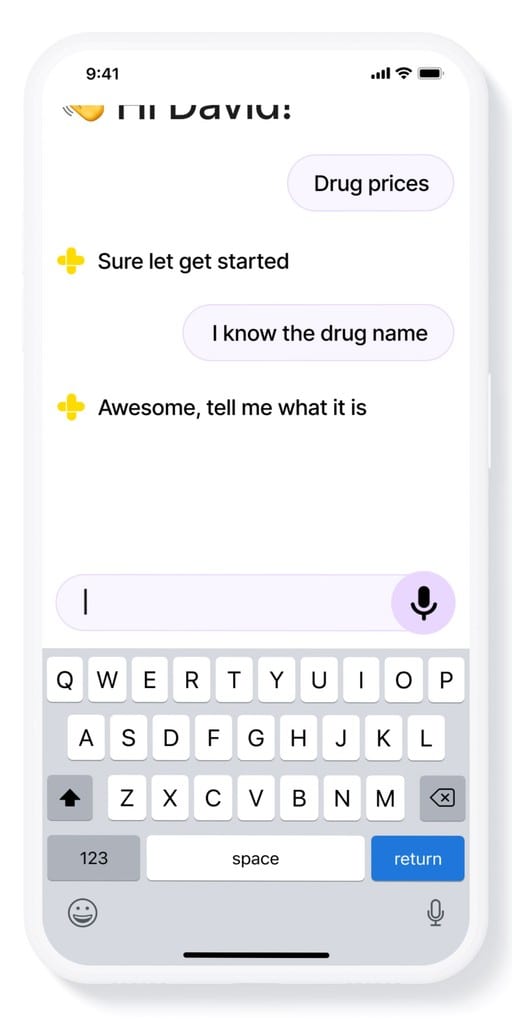
I designed two entry paths. When a customer already knows what they need (below), they can type it or say it and get holistic results built around their query (below middle): price, coupon, and related help in one view rather than scattered across GoodRx's silos.
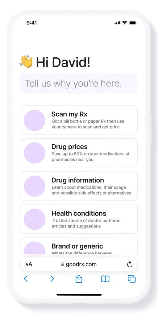
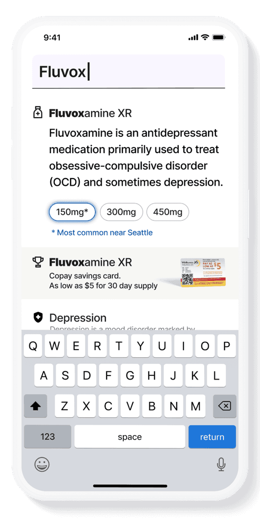
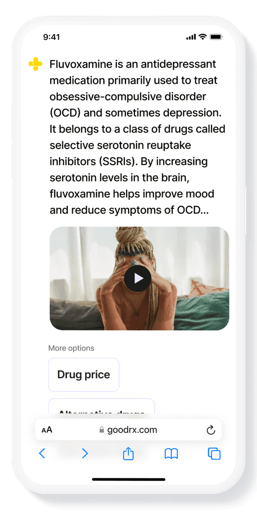
When the customer is unsure, I gave them a second path: a conversational AI experience that guides them to what they need step by step. It builds confidence as it goes and introduces GoodRx's full feature set in context, exactly when each feature becomes relevant.
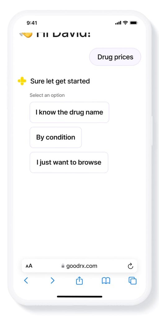
I put GoodRx's features on the homepage as plain-language starting points rather than navigation categories. Tapping one (above left) opens the AI conversation, which guides the customer from there (above right).
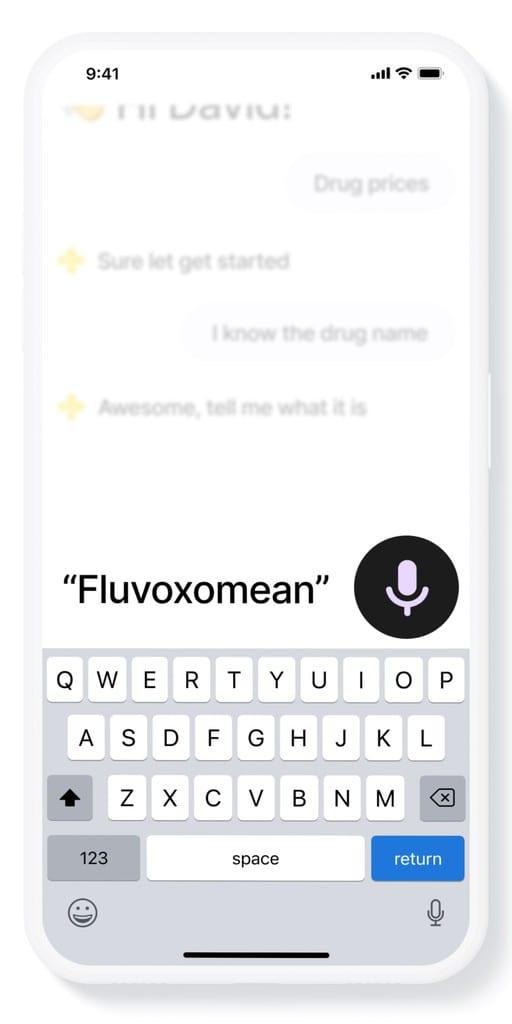
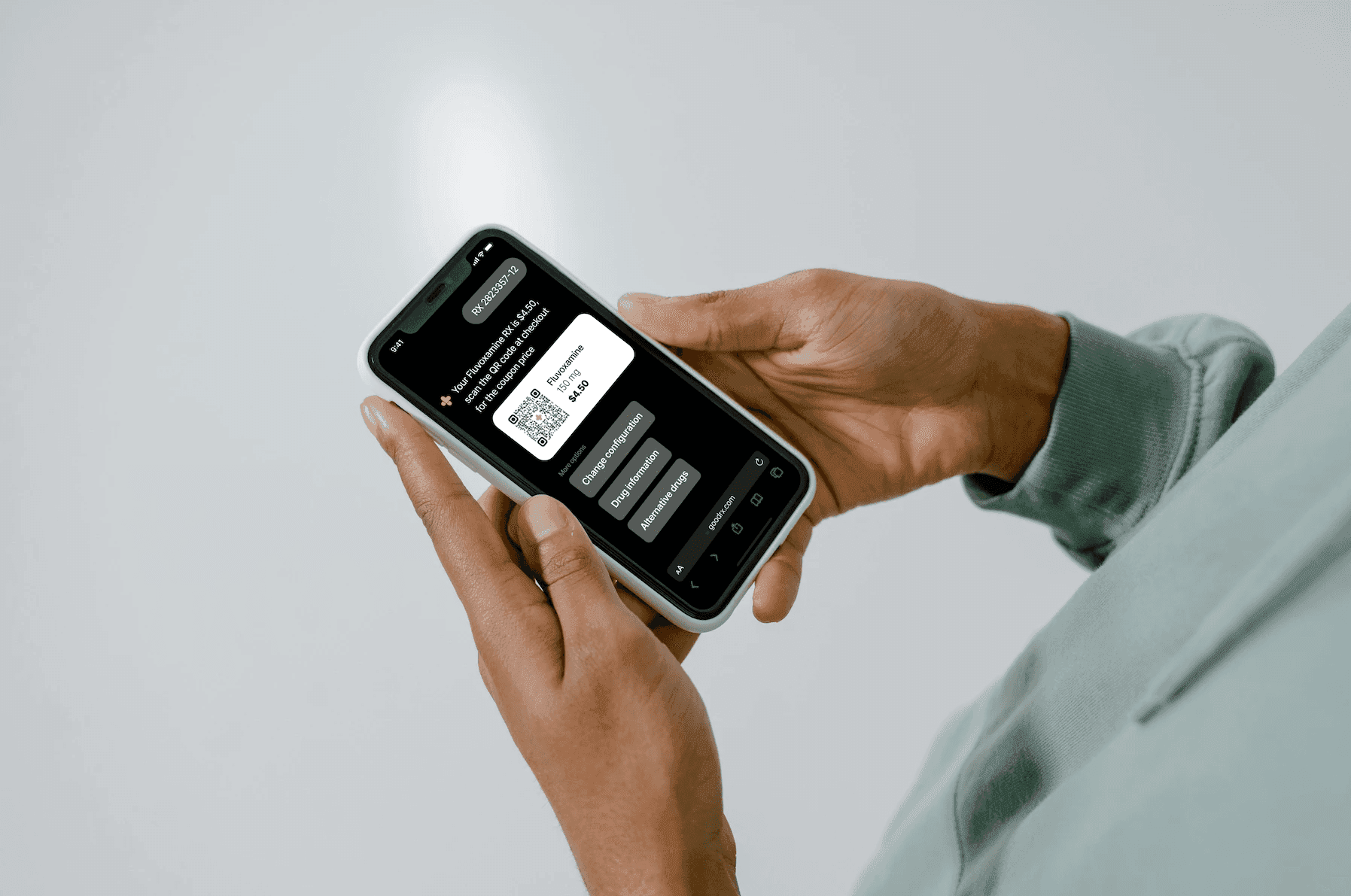
Customers can enter the drug name by keyboard or voice. I pushed for voice (above right) because drug names are notoriously hard to spell: you say it the way it sounds, and the service works out which drug you mean.
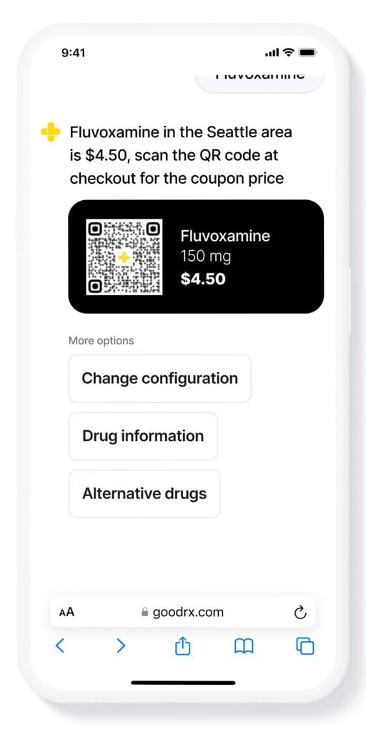
Once the drug is recognized, the price appears with the pharmacy coupon and further options below it (above left). Choosing an option carries the conversation deeper, into drug information for example (above right), instead of dead-ending on a results page.
VISUAL MOCKUPS
Per the constraints, I built on the existing design system rather than replacing it, extending it with the new components the conversational format needed while keeping everything visually native to GoodRx.
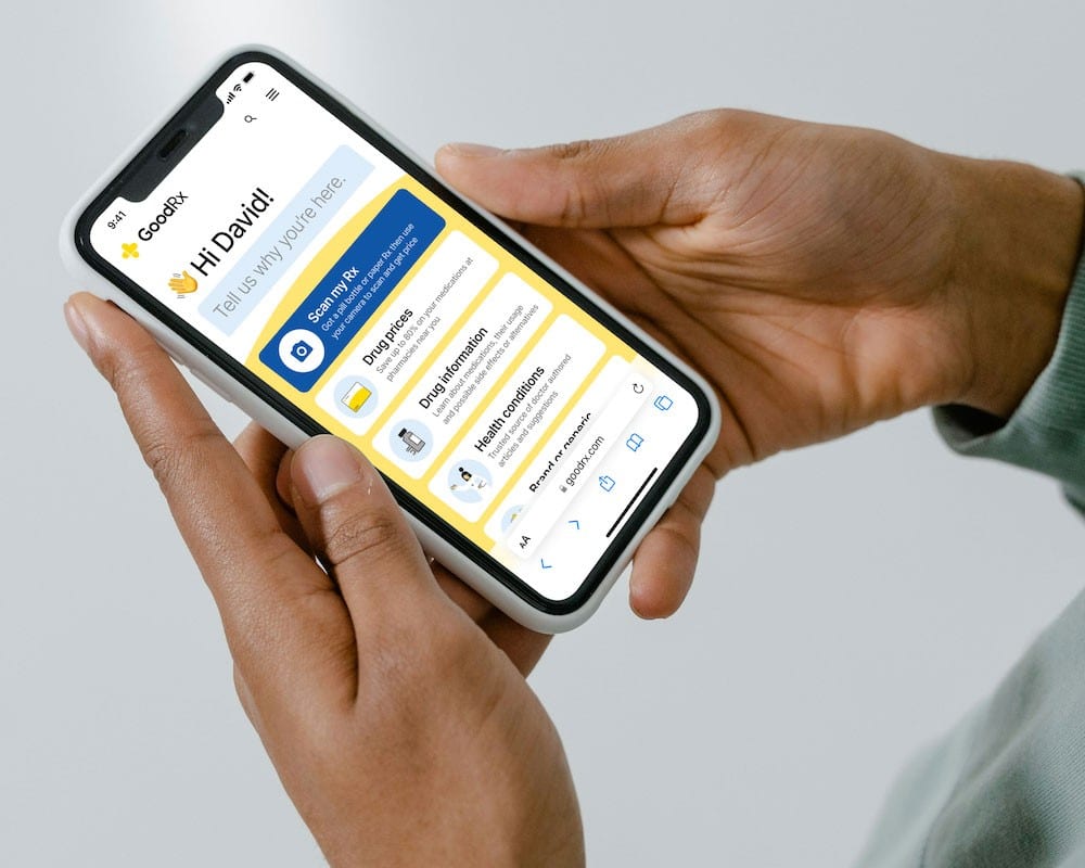
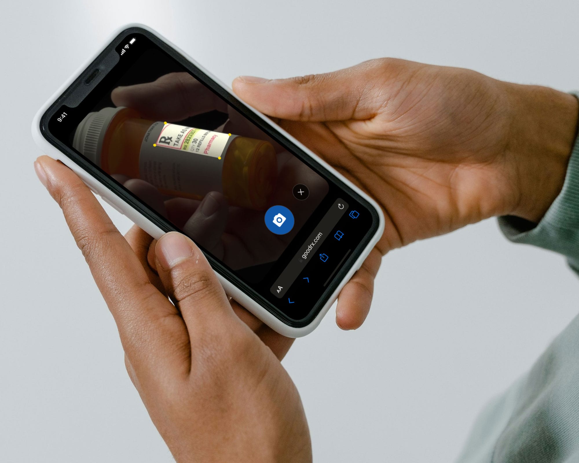
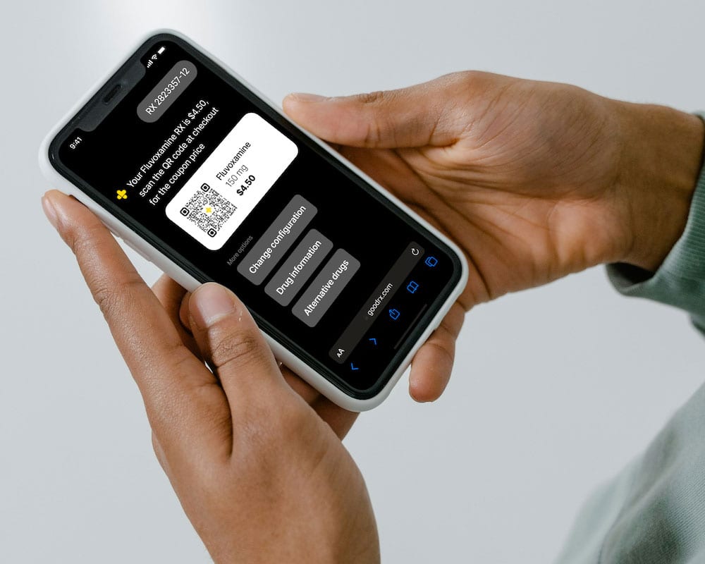
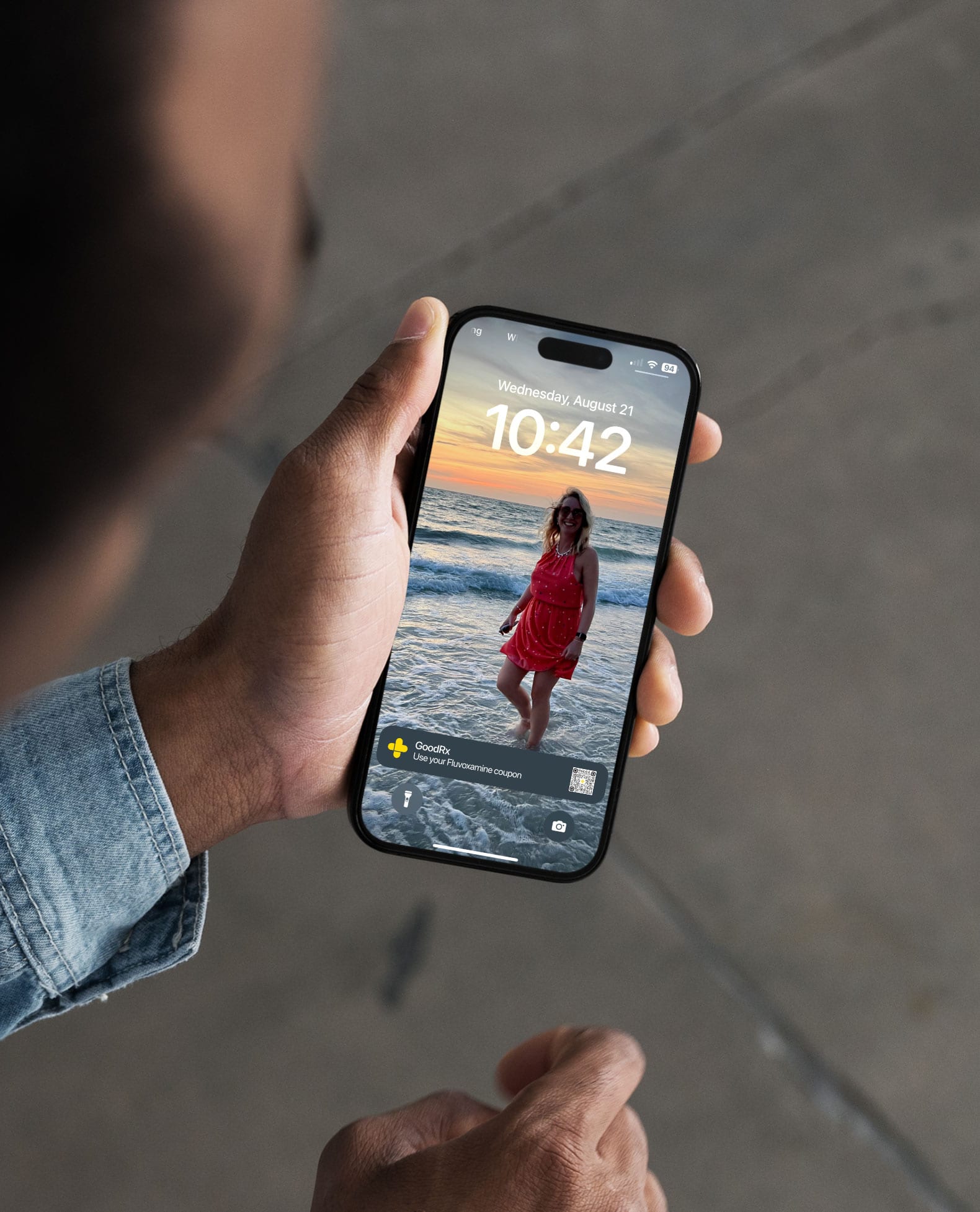
I partnered with the insights team to ship the experience into a live A/B test on the mobile site, the most popular entry point, running against specific customer groups. What we learn there feeds directly into the next iterations, ahead of a broader rollout.
DAILY TEAM
I led product design and drove the vision, blueprints, and end-to-end experience.
Two engineering partners built the experience with me.
One insights researcher ran the testing and A/B measurement.